Share this topic on AskShare this topic on DiggShare this topic on FacebookShare this topic on GoogleShare this topic on TwitterShare this topic on YahooShare this topic on Google buzz

Author Topic: Pop-out Sig  (Read 7819 times)

0 Members and 1 Guest are viewing this topic.

Offline Hi-T3k~HillBilly

  • Administrator
  • *****
  • Posts: 1,526
  • Karma: 0
    • hitech-hillbilly.deviantart.com
    • Facebook:jacob.c.dillon
    • hitek_hillbilly:imageshack
    • droz928: PhotoBucket
    • jcdillon28:twitter
    • HillBillyGFX
Pop-out Sig
« on: May 22, 2006, 09:01:54 PM »
I will be teaching you the basics of making a pop out sig.
I will not be teaching you how to brush or create a background or any of that other stuff.

Step One: Choose a Cut-Out (Render) & create a background

The very first thing you need to do is find the cut-out you want to use as your pop out.

I will be using.


Create a new image for the background.
The image size I usually use for my backgrounds are 400x125.

Here is the one I am using:


Step Two: Enlarge the Canvas

So you have a background and a cut-out.
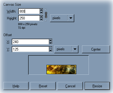
Now select your background image and click Image>Canvas size.
Double the height of the canvas if you are using 400x125 change the height to 250.

Example:

Step Three: Placing the Cut-out

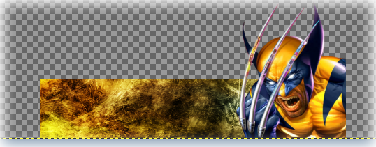
Create a new layer and copy and paste your render into the new layer.
Adjust the size of the layer Layer>scale layer to fit however you want it to.
A handy thing to know is once you have scaled your layer click Filter>Enhance>Sharpen. This will get rid of the blurriness caused by resizing the image!


Step Four: Finishing it up and saving.

Now from here you can add what ever you want. Scan lines, text stuff, detail, what ever your heart desires. Once you have it done and cleaned up merge the visible layers Image>Merge Visible Layers (Ctrl+M).

>>>DO NOT FLATTEN THE IMAGE<<<.
Flattening it will cause the transparent part to become some other color like white, black, blue.

Now click Layer>Transparency>Alpha to seclection. This will seclect your sig!
Copy and paste as a new image.

With the new image active adjust the size to whatever size you deem right. I just redo the width to 400 and leave the height to whatever the auto sets it at.

Once you are done adjusting the size click Filters>Enhance>Sharpen and sharpen it up a bit.
This will get rid of the blurriness that is created by resizing an image.

Now save it as whatevername.png and unclick
Save Background Colors and save color values from transparent pixels

Here is my finished product:


There you have it how to make a pop-out sig!!!!
« Last Edit: September 17, 2010, 03:10:48 PM by Hi-T3k~HillBilly »

Offline Kenny

  • Member
  • **
  • Posts: 786
  • Karma: -1
  • Love my name
Re: Pop-out Sig
« Reply #1 on: August 15, 2006, 08:19:31 AM »
 You are using IE is why. In FireFox there is no white there ;)

Offline fencepost

  • Member
  • **
  • Posts: 2,626
  • Karma: 0
    • fence-post.deviantart.com
Re: Pop-out Sig
« Reply #2 on: August 15, 2006, 08:56:58 AM »
It's an issue with Microsoft.  Supposedly, this will be corrected in their next browser version (7?), which is in beta testing right now, I believe.

Art
I'd rate you as an upper-middle-lower-mod with pro-novice-inter tendencies.....and a twist of lime!  Of course, my rating scale is completely objectively subjective, but ALWAYS consistently inconsistent.

Offline a2j3

  • Member
  • **
  • Posts: 501
  • Karma: 0
Re: Pop-out Sig
« Reply #3 on: October 03, 2007, 11:13:44 PM »

@Droz this is exactly the help I was needing. thank u so much. Can't wait to try this again. lol.  +karma

Offline fencepost

  • Member
  • **
  • Posts: 2,626
  • Karma: 0
    • fence-post.deviantart.com
Re: Pop-out Sig
« Reply #4 on: October 09, 2007, 12:30:22 PM »
I assume you mean that the render is not showing through to the layer beneath it?  No transparency around the outside of the render?  If that's the case, this tutorial might be helpful: Removing Images from their backgrounds (aka rendering).  If this isn't what you mean, if you can give a bit more information, I'll be glad to help.

Art
I'd rate you as an upper-middle-lower-mod with pro-novice-inter tendencies.....and a twist of lime!  Of course, my rating scale is completely objectively subjective, but ALWAYS consistently inconsistent.


Offline Hi-T3k~HillBilly

  • Administrator
  • *****
  • Posts: 1,526
  • Karma: 0
    • hitech-hillbilly.deviantart.com
    • Facebook:jacob.c.dillon
    • hitek_hillbilly:imageshack
    • droz928: PhotoBucket
    • jcdillon28:twitter
    • HillBillyGFX
Re: Pop-out Sig
« Reply #5 on: October 09, 2007, 05:47:22 PM »
What ver of Gimp are you using?


Ok let me clearify that part

Step one - Make sure you merged the visable layers..

Step two - Right click in the layer dialog box and select Alpha to Selection or use the Layers> Transparency>Alpha to Selection
 either way works and both do the same thing. with the sig selected click Edit>Copy (ctrl+c) or Edit>Copy Visible

Than Click edit>paste to new image.
« Last Edit: October 09, 2007, 06:05:43 PM by Droz »

Offline v0id

  • Member
  • **
  • Posts: 128
  • Karma: 0
  • ooo--shiny :D
Re: Pop-out Sig
« Reply #6 on: March 26, 2008, 06:34:26 AM »
i don't see the white...
but im using firefox
« Last Edit: March 26, 2008, 06:34:51 AM by v0id »

we all see what we want to see

SOTW Wins: 11

Offline Darth_Gimp

  • Number One
  • *****
  • Posts: 2,894
  • Karma: 0
  • Faith, Folk, Family!
    • lds-jedi.deviantart.com
    • Odinic Rite
Re: Pop-out Sig
« Reply #7 on: March 26, 2008, 04:04:03 PM »
Keep in mind that this is one style of Pop-Out. Another style is commonly known as "Out of Bounds" and looks like this:


The main difference being that you work with the perspective as well as the pop out. This tutorial that HB did is great and it opens up a new area of graphics for a lot of people. Rose, your outcome looks cool I <3 the Fox!
GimpDome Group: http://gimpdome.deviantart.com/
My DeviantArt: http://lds-jedi.deviantart.com/

There's no worse feeling than that millisecond you're sure you are going to die after leaning your chair back a little too far.

Offline v0id

  • Member
  • **
  • Posts: 128
  • Karma: 0
  • ooo--shiny :D
Re: Pop-out Sig
« Reply #8 on: March 27, 2008, 09:21:05 AM »
here's my result:

its kinda big tho...

we all see what we want to see

SOTW Wins: 11

Offline v0id

  • Member
  • **
  • Posts: 128
  • Karma: 0
  • ooo--shiny :D
Re: Pop-out Sig
« Reply #9 on: March 30, 2008, 08:02:56 AM »
you need to enlarge the canvas size and/or scale your render so it fits

to enlarge the canvas: Image --> Canvas Size
     then unclick the chain to edit X and Y independently (or keep it) and enlarge the canvas to the desired size without stretching anything

to scale the render: select the render layer and go to:  Layer --> Scale Layer
     you can then adjust the size of the render's layer and consequently the render itself

we all see what we want to see

SOTW Wins: 11


Tags:
 

anything