Although GIMP is not a 3D program, we can use its various tools to give our graphic creations some sense of depth. After all, there's nothing worse than having a piece of work look unrealistic. In this tutorial, I'm going to show you how to create some 3D-looking text, like this one below.

For you experienced gimpers, you'll move through this like melted butter. However, for you noob's, I'll try to explain everything in detail, so that you can finish it with minimal pain!
Recently I made a sig with a 3D text program for the text and GIMP to do the background brush, smudge, and touch up work. I got so much positive feedback on it and received requests for a tutorial, that I kinda felt it was my duty to figure out a way to accomplish it in GIMP by itself. So, I hit the Google trail looking for 3D text in Photoshop and after compiling my favorite techniques those tutorial writers presented and adding a few touches of my own, this is what I came up with.
Please keep in mind, there are many ways to accomplish what we're going to do in a minute. You may wonder why I did a particular step in a certain order or why didn't I use a certain filter, etc. Remember, this is a tutorial. We can't add everything in at once or we'll never finish! Besides, don't ask such questions!

Let's begin:
Step 1 - Project Initialization:- Create a new document of any size with a black background.
- Grab your text tool and your favorite font and add your text in the color you desire. (I'm using the font Amethyst Ultra-Light. I don't believe it's a free font so I better not post it for download. But, I do recommend you start with a fatter font.)
- Duplicate this layer twice and change the color of one of the duplicates to white. You can just highlight the layer you want to change and drag/drop the white color swatch over the text layer to change its color. Since it's still an editable text layer, only the text color will change.
- Right click on each text layer and choose Layer to Image size.
- Now, add a white layer. This will just be used for a background to make things stand out while we're working.
- Reorder your layers as shown. I've given them descriptive names so you can refer to them throughout.
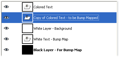
In most of the tutorials I've reviewed, the authors made a number of duplicate copies of the lower layer and realigned them below and to the side of the top layer to give the 3D effect. While this works ok, it doesn't add the depth we want. They tend to look flat. Only one writer that I reviewed suggested using the following steps, which really adds to the effect. His recommended steps give the text "sides" the appearance of shadows and texture. His steps were accomplished in a different fashion. In GIMP, we will use the Bump Map tool found here: Filters | Map | Bump Map. But before we go to that filter, we need to create a bump map.
Step 2 - Create Bump Map:- In the layer's dialog window, highlight your white text layer and merge it with the black layer.
Your layers should now look like this:
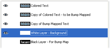
- Go to the Filters | Blur | Gaussian Blur filter and give the combined black and white layers a little bit of blur. I used 10 for both x and Y settings.
Step 3 - Bump Map Text:- In the layer's dialog window, highlight the "copy of the colored text" layer
- Go to Filters | Map | Bump Map and use the following settings:
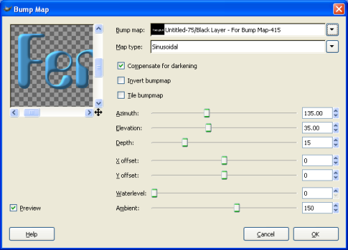
Make sure your black and white layer is selected for the bump map.Step 4- Layer Transformation:There are a couple of ways to accomplish transforming layers to give them some perspective. However, I don't like the transform tool buttons much because I can't always get the results I'm after. If they work well for you, go for it, but here's how I transformed my layers.
- Highlight one of your text layers and Go to Filters | Map | Map Object and use these settings:
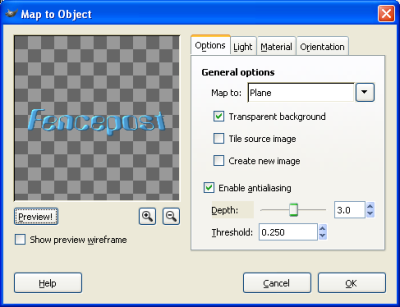
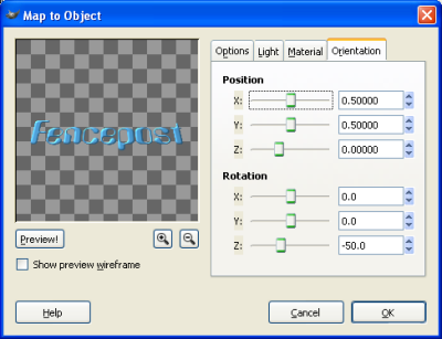
I didn't change the light or material settings for this tutorial, but I believe it's good idea to experiment with those and see what kind of results you can get.
- Now, do the same thing for the other text layer. Your outcome should resemble this:

Notice that your bump-mapped layer is hidden below the flat text. This is what we want.
Step 5 - Bump Map Text 2:- Highlight your upper text layer. The flat one.
- Go to Filters | Map | Bump Map and choose the following settings (Make sure you're using the flat-colored text layer to bump map itself. Yes, you can do that):
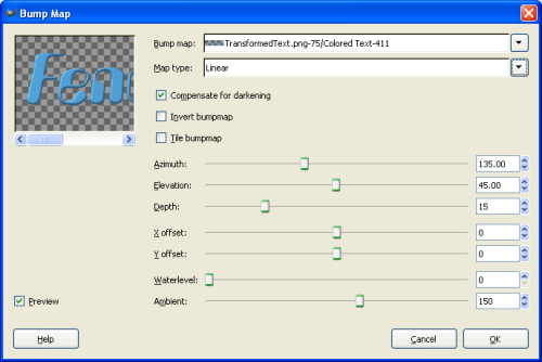
At this point, you may be asking yourself, "Why didn't he Bump Map this layer while we were still up in step 3?" Well, first off, I told you not to ask that question. Secondly, I could have, but I forgot to, and my screenshots were already prepared. LOL! So there! Now you know. ;D
Step 6 - Adding depth (approaching the final turn):- Highlight your bottom text layer. The one we bump mapped first.
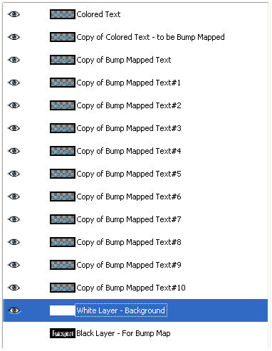
- Duplicate it and drag it below all the other text layers.
- With this layer still selected, grab your move tool (4-headed arrow) and then just click on the image window to make it active. Hit you down arrow one time to move that layer down 1 pixel.
You could have also used the Layer offset menu (Layer | Transform | Offset - Shift+Ctrl+O) to do the same thing. Just leave x=0 and y=1, but that's really up to you how you want to move your layers.- Now, make a copy of the layer you just moved, drag it to the bottom of the text layers, and move it down 1 pixel.
- Continue doing this until you're satisfied. I used 11 copies.
Here's what my layers look like now:
Step 7 - This is the end (finishing touches)
Let's add a few shadows. I added 3 to mine. I'll list the settings below. You add as many or as little as you want. Experiment with the settings. To add the shadows, highlight your very bottom text layer copy. Then, go to Script-FU | Shadow | Drop Shadow.
- Dark Shadow (no not the vampire soap opera of the late 60's! LOL!)
X=1 ; Y=1 ; Blur =1; Opacity=100 ; Color=Black; Deselect "Allow resizing"
- Light Shadow to the right
X=5 ; Y=2 ; Blur =10; Opacity=50 ; Color=Black; Deselect "Allow resizing"
- Light Shadow to the left
X=-2 ; Y=0 ; Blur =10; Opacity=50 ; Color=Black; Deselect "Allow resizing"
That's it. Your text should resemble something like this:

Well, I hope this tutorial has shown you something new that you'll be able to incorporate into your own works. Hopefully, I've explained everything properly and didn't leave anything out. I look forward to seeing your afforts. As always C & C are welcome!
Keep on GIMP-ing!
Art